Logo System
Logo Usage
Six logo variants across positive, negative, and keyline treatments. Choose based on background — always ensure sufficient contrast and clear space.
Light backgrounds
Dark backgrounds
Light backgrounds
Dark / Olive backgrounds
Warm backgrounds
Brand backgrounds
Clear Space & Exclusion Zone
¼× logo radius
¼× logo radius
¼× logo radius
¼× logo radius
Minimum clear space
Always maintain a clear zone equal to one quarter of the logo's outer circle radius on all four sides. Nothing — text, imagery, graphics, or the edge of a document — should enter this zone.
Minimum size — digital
Never reproduce the logo smaller than 80px wide on screen. Below this size the letterforms and fine details become illegible.
Minimum size — print
Never reproduce the logo smaller than 20mm wide in print applications. Always supply as a vector file (SVG or EPS) for print use.
Co-branding & lockups
When the h2o logo appears alongside a partner or client logo, double the minimum clear space and use a neutral dividing line. The h2o logo should never be smaller than the partner logo.
Logo Positioning
Standard placement — corner
In all standard applications — print, digital, advertising, email, social — the h2o logo sits in a corner of the design. Typically bottom-left or top-left, maintaining the defined clear space from the edge. This is not negotiable in brand communications.
Exception — presentations
In PowerPoint and Google Slides templates, the logo may be centred or positioned on a dedicated title/closing slide for emphasis. On all other slides it returns to a fixed corner position, consistently placed across every slide in the deck.
Never centred in body layouts
Do not centre the logo within the body of a page, poster, or advertisement. Centred placement weakens the mark's authority and creates spatial tension with other layout elements.
Standard placement
What Not To Do
Don't stretch or distort
Always scale proportionally
×
Don't rotate
Logo must always be upright
×
Don't place on busy backgrounds
Low contrast backgrounds not permitted
×
Don't recolour
Only approved brand colours permitted
×
Don't add effects
No shadows, glows, or outlines
×
Don't use below minimum size
80px digital · 20mm print minimum
×
Don't add outlines or boxes
Logo needs clear space, not containment
×
Don't use positive on dark
Use the negative (white) version instead
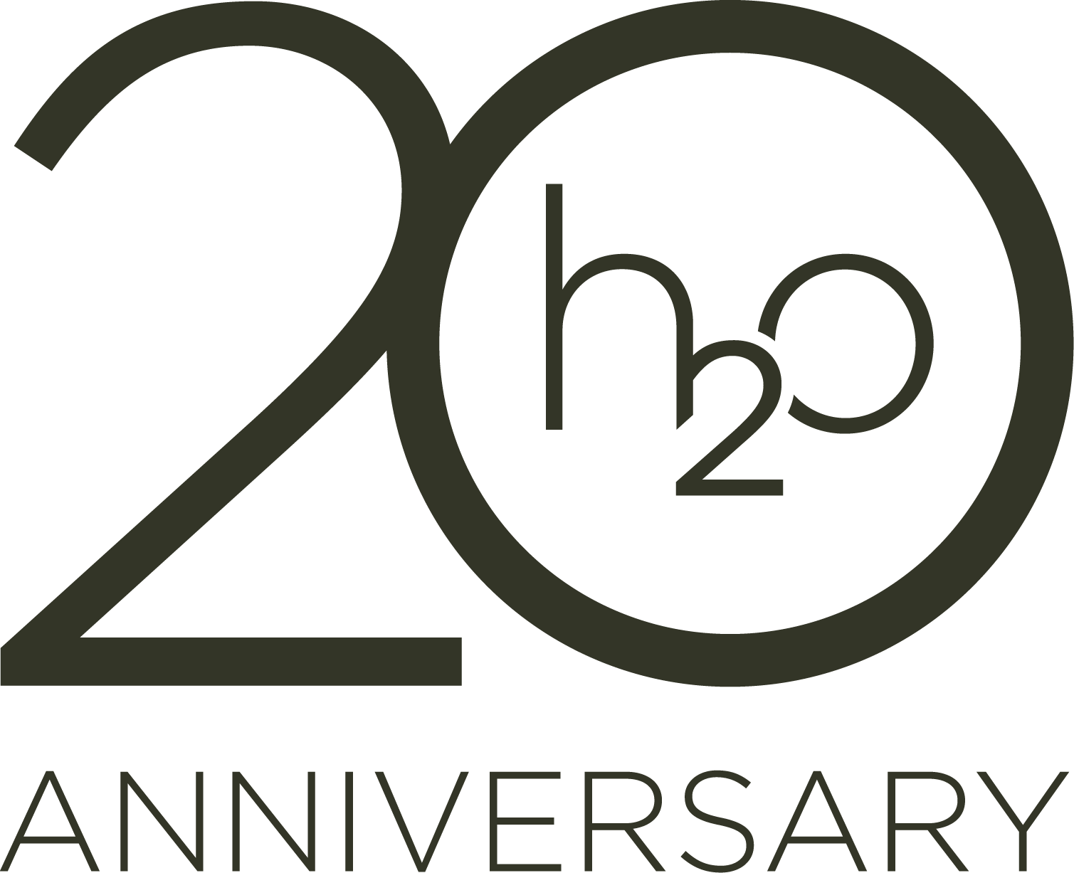
20th Anniversary Edition
A special-edition mark celebrating two decades of h2o creative. Use exclusively for 20th anniversary communications, events, and collateral — not as a substitute for the primary logo in standard applications.
 Negative (White)
Dark & Ink backgrounds
 Positive (Olive)
Light & White backgrounds
Usage guidance: The 20th Anniversary logo should only appear on materials explicitly related to the anniversary milestone — event collateral, anniversary campaigns, celebratory communications, and dedicated social content. Always use the Negative (white) version on dark or Ink backgrounds, and the Positive (Olive) version on light, cream, or white backgrounds. Do not combine the anniversary mark with the standard logo on the same layout.
Correct Usage
Do Always
- Use the positive logo on light, cream, and sand backgrounds
- Use the negative logo on Ink, Olive, and dark backgrounds
- Maintain minimum clear space (1× "h" height) on all sides
- Scale proportionally — never stretch or distort
- Use the keyline variant for refined, secondary applications
- Use the anniversary mark only for milestone communications
- Supply vector files (SVG/EPS) for all print use
Don't Never
- Do not place the positive logo on dark or photographic backgrounds
- Do not add drop shadows, glows, outlines, or effects
- Do not recolour outside the approved brand palette
- Do not rotate, skew, or distort in any direction
- Do not use below minimum size (80px digital, 20mm print)
- Do not place on low-contrast or busy backgrounds
- Do not use the anniversary logo as the primary brand mark