Graphic Assets
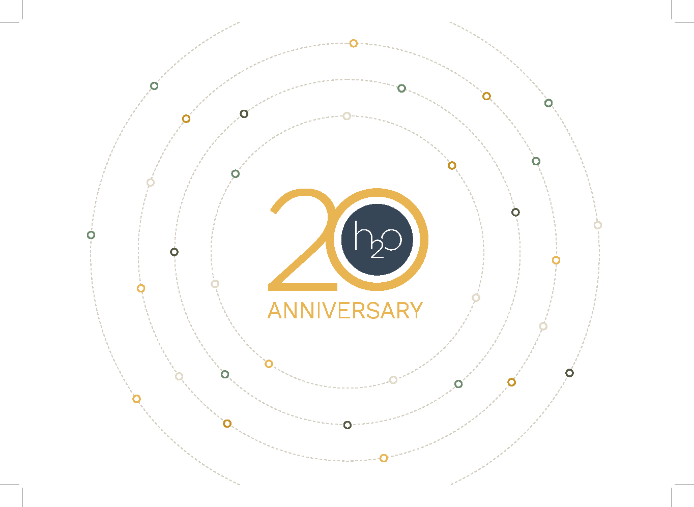
Four primary graphic elements define the h2o visual language — the Orbiting Circles, Infinity Loop, Arrow Graphic, and Touchpoints Graphic. All are built from dashed orbital paths and open-circle nodes in the brand palette, communicating interconnection, momentum, and the continuous marketing cycle.
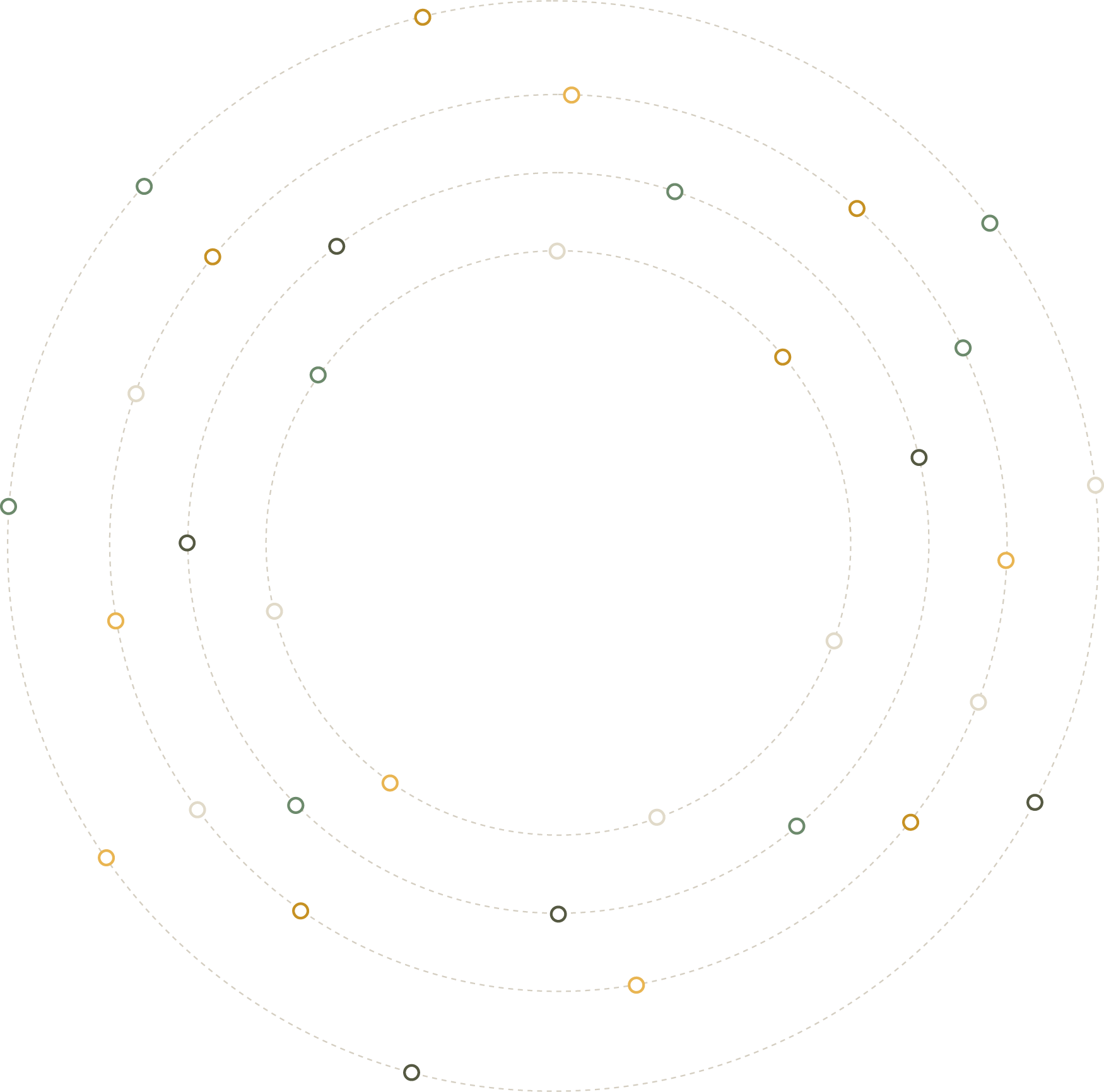
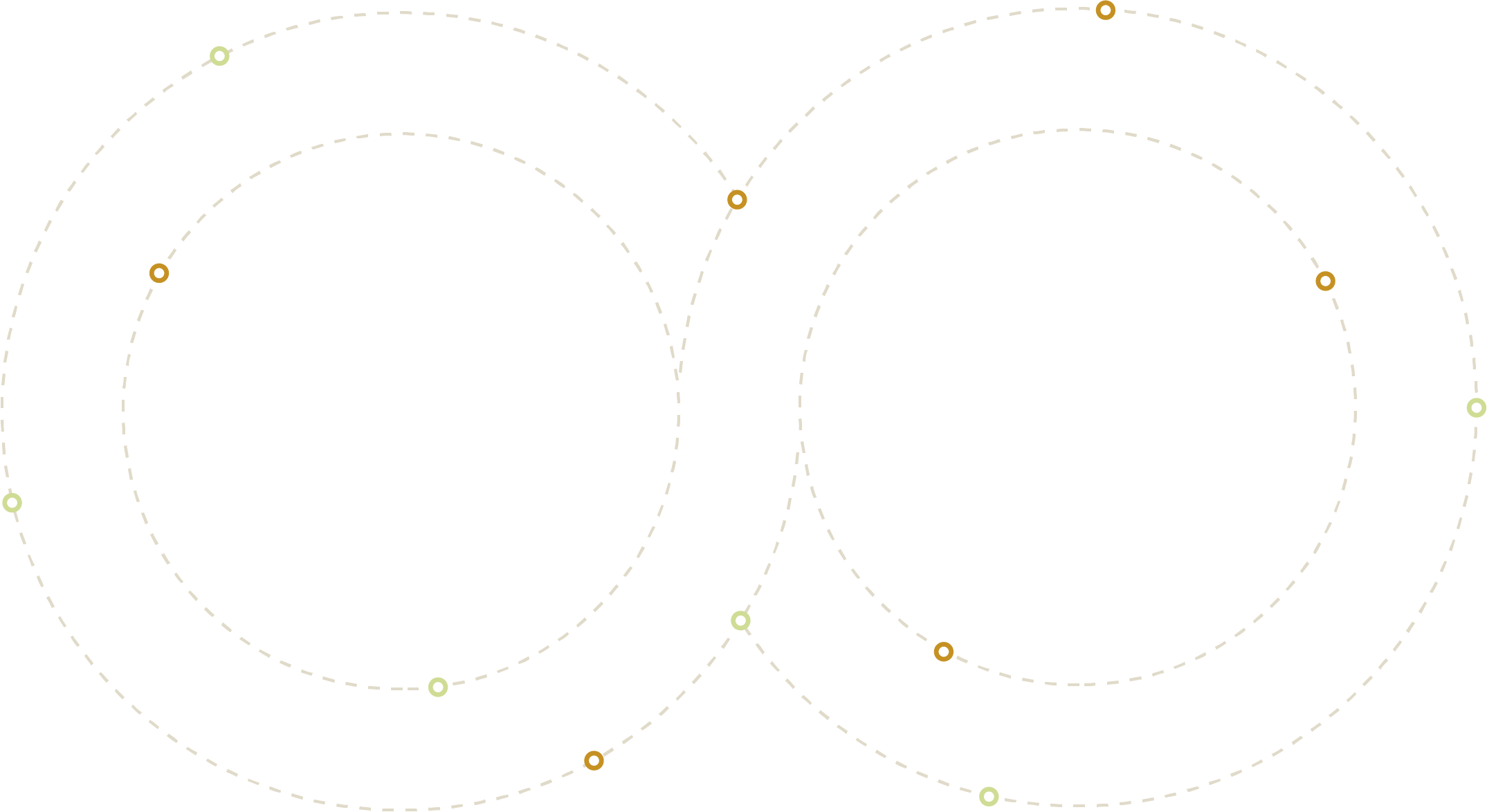
All four graphics use the same node colours: Gold (#E5AC34), Sage (#879F80), Ink (#323526), and pale Sage/Lime (#D3E694). Never recolour nodes individually — the multi-colour node language is intentional and must stay intact.
All four assets are built for motion. Orbiting Circles and Touchpoints: nodes rotate or travel their arc paths. Infinity Loop: nodes travel the figure-eight continuously. Arrow: dots pulse or shift in density. Use easing — never linear. Pace should feel calm and measured.
Orbiting Circles, Arrow, and Touchpoints can bleed to edges and be partially cropped. The Infinity Loop must always be shown in full. Orbiting Circles and Infinity Loop are designed for light backgrounds; Arrow and Touchpoints work on dark grounds.
The Circle Language
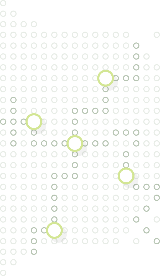
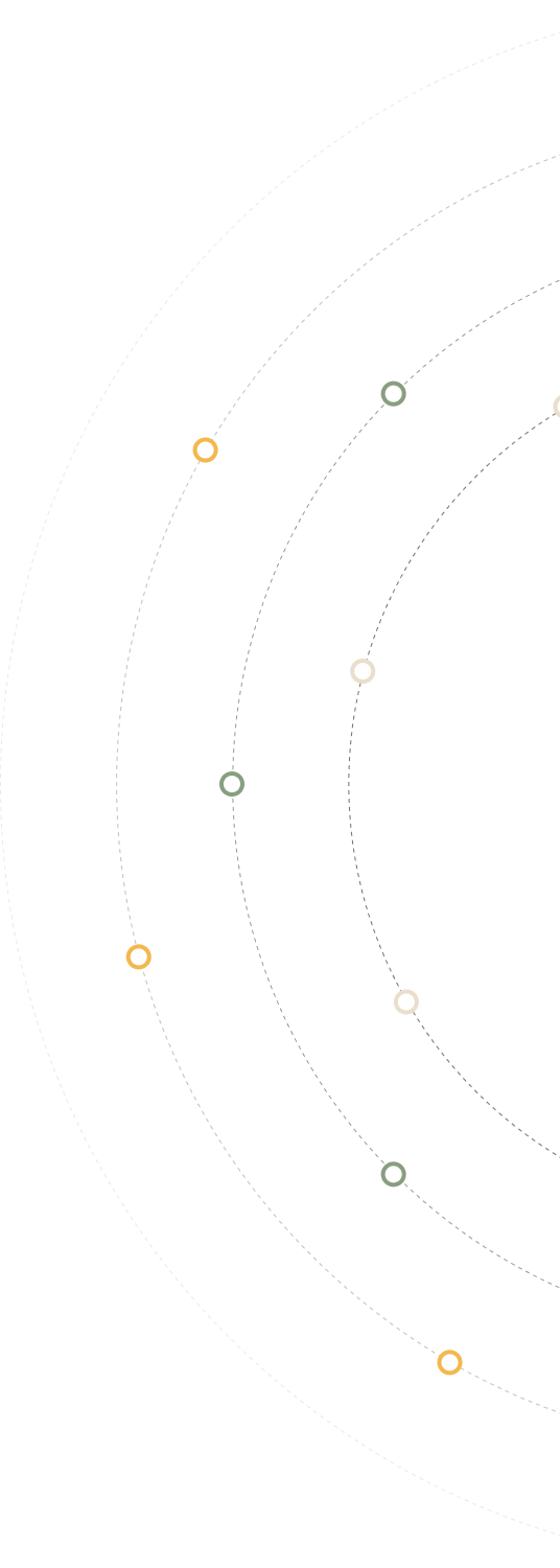
Circles and arcs are the structural backbone of the h2o visual system — used to create graphics, divide space, contain imagery, and mark moments on a journey. The ring form — a solid circular stroke with an open centre — exists in every palette colour and is the primary node element across all brand communications.
Circle Palette
The ring form exists in every brand colour. Select the variant that suits the background — ensuring the ring reads with sufficient contrast and sits naturally within the palette combination in use.
Ink
Olive 800
Slate 800
Gold 500
Gold 700
Honey 500
Sand 400
Sage 500
Lime
Tealgray 400
Bluegray 500
Bluegray 200
Circles as Nodes
The ring form is used as a node element — positioned along dashed lines to mark points on a journey, stages in a process, or milestones in a project. The open centre gives each node visual weight without solidity; the dashed connector implies progression without rigidity.
Awareness
Consideration
Decision
Onboarding
Advocacy
Discovery
Strategy
Creative
Launch
Optimise
Supporting Graphic Elements
Visual Style
Our photography feels like a genuine moment caught — natural light, real environments, people in motion or absorbed in thought. Never posed, never performative. The camera is a quiet observer, not a director.
Subjects never look directly at the camera. They're engaged with each other, their work, or their surroundings. This creates authenticity — the viewer feels like they've caught a real moment, not been invited into a staged one.
Prefer available, ambient light over studio setups. Warm morning tones, soft window diffusion, dappled outdoor light. Avoid harsh flash, over-exposed whites, or clinical studio backgrounds that feel sterile.
Real offices, real streets, real spaces. Not white cyc studios or artificially pristine rooms. Slight imperfections and lived-in environments add credibility and warmth to the brand story.
Capture people mid-gesture, mid-conversation, mid-thought. Walking, talking, writing, laughing. The energy of doing — not the stillness of posing.
Photography should sit comfortably within the brand palette — warm, earthy tones complement our creams, sands and olives. Avoid oversaturated, high-contrast edits or heavy vignetting.
Negative space is an asset. Allow breathing room around subjects. Offset compositions, natural depth of field, and slightly looser crops feel more editorial and less stock-library.
Photography Style Reference
Visual Style
Our illustration style pairs flat, abstracted figures with the brand's circle language — Ink outlines, Lime and Sage fills, and Gold accent nodes. People are shapes, not portraits. Circles are always structural, never decorative. The overall feeling is warm, modern, and purposeful.
All shapes carry a consistent Ink (#323526) stroke — 2.5px at standard illustration sizes. Outlines never change colour. No drop shadows, inner glows, or gradients on any shape.
Ink, Lime, White, and one accent (Gold or Sage). Figures are Lime-filled with Ink outlines. Dark variant: Ink-filled figures on a black ground. Never more than four colours per piece.
The ring and circle forms are always integral to the composition — not decorative. They act as icon containers, backdrops for figures, and connectors in the orbit system. Never use a circle as mere decoration.
Charts and graphs using Lime fills, Ink outlines, and Gold/Lime orbit nodes as data callouts
Figures in real-world settings — circle containers hold icons, dashed lines connect elements
Work in Action
Real campaign materials produced for the SMMT Connected 2026 event — the Society of Motor Manufacturers and Traders' annual automotive technology summit. These pieces demonstrate the brand system applied across print formats: exhibition banner, A3 poster, and A5 postcard front and back.
20th Anniversary
Personalised thank you cards sent to every member of the team to mark the start of h2o's 20th anniversary year. Each card was individually named — the front features the Orbiting Circles asset with the anniversary mark centred, the inside carries a personal message with the recipient's photo in a Gold keyline circle.