Section 10
Footer Anatomy
Dark footer with 4-column grid. Brand column wider (2fr). B Corp badge bottom-right. All text rgba(255,255,255,0.5). Bottom border divider 1px rgba(255,255,255,0.07).
© 2025 h2o creative. All rights reserved.
Privacy Policy
07 — Web
How the h2o brand translates into web. Layout patterns, section anatomy, component interactions, and spacing logic — all drawn directly from the live site design.
Section 1
The LP is built as a sequence of full-width sections. Each section has a defined role, background treatment, and typographic scale. Heights are content-driven, never fixed.
Section 2
Fixed nav, 114px tall. Light variant on light backgrounds; dark variant for dark sections. CTA button always uses Lime #D3E694 with Ink text.
Light Nav — Default
Dark Nav — Over dark sections
Height
114px
Fixed. Blurs background on scroll using backdrop-filter.
Logo Treatment
Kantumruy Pro Bold
Wordmark. No icon at nav size. Accent dot in Lime #D3E694.
CTA Button
Lime Pill
bg: #D3E694 · color: #323526 · radius: 999px · padding: 12px 24px
Nav Links
12px / 400 / +0.1em
Uppercase. Gap 36px. Opacity 0.7 default, 1 on hover/active.
Section 3
875px tall. Large circle photo on right, headline text block left. Background graphic: Large Circles dot matrix fades from top-left. Circle image uses 500px border-radius with inset shadow.
Push it. Shape it. Drive it. Lead it. Grow it.
Headline Scale
128px / Bold / -5%
Line-height: 128px. Tracking: -6.4px. Word 1 in Sage #545940, rest Ink.
Sub-headline Variant
24px / Mixed weights
Bold, Bold-Italic, Underline-Bold combo. Tracking: -1.2px. All Sage #545940.
Circle Crop
1000 × 1000px
border-radius: 500px. Inset shadow: 25px 25px 100px rgba(0,0,0,0.25). Right edge bleeds off-screen.
Graphic Overlay
Large Circles Asset
Positioned top-right behind text. 1500×1500px, y: -90px offset. Low opacity, decorative.
Section 4
Auto-scrolling client logo strip. White circle pill containers, hard drop shadow, 144px × 144px. Animation: infinite horizontal translate. Duplicated set for seamless loop.
Container
144 × 144px pill
border-radius: 80px. bg: #FFFFFF. shadow: 15px 15px 0px rgba(0,0,0,0.05).
Animation
Infinite scroll
translateX(-50%) over 20–25s linear. Double the logos to create seamless loop.
Section 5
White card with dramatic asymmetric border-radius (320px bottom-right creates concave curve). Contains agency descriptor text plus interactive buzzwords toggle.
We're an integrated marketing agency helping brands grow and stay visible throughout long buying cycles. From PPC and SEO to CRM, lifecycle marketing and fully integrated campaigns, we turn activity into actual business growth.
Card Radius
border-radius: 320px br
Top-right: 24px, Bottom-right: 320px, Bottom-left: 24px, Top-left: 320px. Creates the signature h2o concave curve.
Text Size
40px / Bold / -2px
Heading 3 scale. Sage #545940 for intro, Ink #323526 for emphasis. Line-height: 56px.
Toggle Component
Buzzwords: ON
bg ON: #D3E694 · bg OFF: #B7C5B3. Label: 12px uppercase. Toggles between "we make" and agency description.
Arc Graphic
Arrow Graphic Animation
853 × 853px. Centered right half. Consists of 20-row dot matrix in brand palette. Animated on scroll.
Section 6
928px section. Left: touchpoint dot-matrix graphic (animated nodes in Sage/Lime/Ink). Right: sticky text block that scrolls at 100% top offset.
In fact, many of them involve dozens of different touchpoints, with buyers jumping around and expecting an experience that's relevant and consistent.
At h2o, we keep it all connected, sharpening your message and helping you react quicker with more agility. Making your message different. That's what makes us different.
Heading Scale
80px / Bold / -4px
dsk/headings/2. Sage #545940 for sentence opener, Ink for emphasis words. Lime dot at end.
Sticky Scroll
position: sticky; top: 0
Right text panel is sticky. Left graphic scrolls at natural speed, creating parallax separation. Height matches full section.
Dot Matrix Graphic
Touchpoints Animation
612 × 1052px. 3 node colours: Sage (open ring), Lime (filled), Gold (highlighted). 5 glowing keyframe nodes animate in sequence.
Ellipse Accent
851 × 851px
Soft sage ellipse positioned far right. bg: rgba(135,159,128,0.08). Decorative depth element.
Section 7
3-column card grid. White cards on light bg, dark (#323526) cards used for featured services. Hover: translateY(-4px) + deeper shadow. Cards use 20px radius.
PPC & Paid Media
Performance campaigns across Google, Meta and programmatic — built around your conversion goals, not vanity metrics.
SEO & Organic
Long-term visibility through technical SEO, content strategy, and authority building that compounds over time.
CRM & Lifecycle
Nurture and retention programmes that keep buyers engaged across long, complex buying cycles.
Integrated Campaigns
Idea-led work that ties all channels together — brand and performance working in service of each other.
Analytics & Insight
Data infrastructure and reporting that gives you a clear view of what's actually driving growth.
Brand & Creative
Visual identity, campaign creative and brand systems that make every touchpoint consistently h2o.
Card Radius
20px
All service cards use 20px border-radius. Shadow: 10px 10px 0px rgba(0,0,0,0.05).
Dark Card Treatment
bg: #323526
Icon bg: rgba(255,255,255,0.08). Icon color: #D3E694. Tags: rgba(255,255,255,0.08) bg.
Hover State
translateY(-4px)
transition: 0.25s ease. Shadow deepens on hover. No colour changes on the card itself.
Icon Container
48 × 48px / 12px radius
Filled bg. Icon size: 18px. Sage on light, Lime on dark. No border.
Section 8
Dark #323526 background. Numbers in Lime #D3E694. Labels in muted white. Separated by 1px rgba(255,255,255,0.08) dividers. No border-radius on strip itself — full bleed.
Section 9
Dark section with form on the left (white card) and partnership copy on the right. Form inputs: 5px radius, no border, offwhite background, gold focus ring. Submit CTA: Lime pill button.
We work as an extension of your team — embedded, agile, and aligned to your goals. No account management layers, no wasted time.
Section 10
Dark footer with 4-column grid. Brand column wider (2fr). B Corp badge bottom-right. All text rgba(255,255,255,0.5). Bottom border divider 1px rgba(255,255,255,0.07).
© 2025 h2o creative. All rights reserved.
Privacy Policy
Section 11
How each brand colour token maps to its specific web execution role. Background, text, interactive, accent, and graphic layers each have a defined owner.
#F9FAF9 — Page Background
Default page bg. All sections without explicit override use this. Light, near-white with green undertone.
#323526 — Ink / Dark Sections
Hero headlines, dark section backgrounds, footer, nav dark state. Primary text colour throughout.
#545940 — Secondary / Olive
Hero headline word 1 (e.g. "Marketing,"). Challenge heading opener. Body text on white cards.
#879F80 — Sage / Brand Green
Graphic accents, touchpoint nodes, section title highlights, portal navigation. Never used as body bg.
#D3E694 — Lime / Tertiary
All primary CTAs (buttons, nav). Stat numbers. Accent punctuation dots in headlines. Toggle ON state.
#B7C5B3 — Primary 200
Divider lines (2px). Toggle OFF state. Muted supporting elements. Not used for text.
#E7ECE6 — Primary 100
Form input backgrounds. Tag pill backgrounds. Card subtleties. Never as section background.
#FFFFFF — White
Card backgrounds (service cards, logo pills, intro card). Always with 10px 10px 0px drop shadow.
Section 12
Kantumruy Pro across all roles. Five named scales from dsk/headings/1 (128px) down to labels/small (12px). Letter-spacing always negative on display sizes, positive on labels.
dsk/headings/1 — Hero
Marketing.
dsk/headings/2 — Challenge
Far from simple.
dsk/headings/3 — Section
We make:
dsk/headings/5 — Cards
Integrated Campaigns
dsk/p/standard — Body
We keep it all connected, sharpening your message and helping you react quicker with more agility.
labels/large — Navigation / CTAs
HOW WE HELP SEE FOR YOURSELF
Section 13
A reference catalogue of every repeating layout pattern in the h2o website design system — ready to brief into development.
| Pattern | Background | Layout | Notes |
|---|---|---|---|
| Sticky Text + Scrolling Graphic | #F9FAF9 | 50/50 split | Right text sticky top:0. Left graphic scrolls naturally. Used: Challenge section. |
| Asymmetric Rounded Card | White | Full width | border-radius TL: 320px, BR: 320px. Graphic bleeds right edge. Used: Intro card. |
| Round Crop + Text Left | #F9FAF9 | 45/55 split | Circle image 1000px radius, absolutely right-positioned. Text left with button pair. Used: Hero. |
| 3-Col Service Grid | #F9FAF9 | 3 columns | Mix of white and dark cards. 20px radius. Icon + title + desc + tags. Used: What We Do. |
| Stats Bar | #323526 | 4 columns | Numbers in Lime. Labels in rgba white. Vertical dividers. Full-bleed section. |
| Form + Copy Split | #323526 | 50/50 split | Form in white card left. Partnership points right. Form inputs: 5px radius, no border, gold focus. |
| Logo Reel | #F9FAF9 | Scrolling row | 144×144px pill logos. Shadow: 15px 15px 0px. Infinite translateX animation. Duplicate set for loop. |
| Dark Footer Grid | #323526 | 2fr 1fr 1fr 1fr | Brand col wider. B Corp badge bottom-right. Bottom border: 1px rgba(255,255,255,0.07). |
| Section Eyebrow + Divider | Any bg | Label + line | 10–11px uppercase label. 2px sage-200 divider line extends to right edge. Used above all major headings. |
| Dot Matrix Background | Transparent | Absolute layer | 24px spacing grid. 3 node types: grey open circle, sage active, lime highlight. z-index behind content. |
Web Execution — Do / Don't
14 — Brand-to-Web Styling
How every element of the h2o brand identity — logo, colour, type, components, icons, voice, and motion — translates into the website's visual language. The executional bible for building in-browser.
01 — Logo
Three lockup variants are defined for web. The primary wordmark is used at nav and hero scale. Never rasterise — always render as text or SVG to preserve crispness at all resolutions.
Used on all light (#F9FAF9 / #FFFFFF) backgrounds. Ink #323526 wordmark. Lime #D3E694 dot accent. Minimum size: 48px cap height.
Used on mid-tone sage or offwhite surfaces. Secondary #545940 wordmark. Sage #879F80 dot. Retains legibility at 80%+ contrast.
White wordmark on all dark (#323526) sections. Lime dot preserved. Used in footer, dark nav, and dark hero overlays.
Clear Space Rule
Minimum clear space = cap-height of the "h" on all four sides. No other brand elements, text, or imagery within this zone.
Size Thresholds
02 — Colour
Eight tokens define the full palette. Each has a specific role — background, text, interactive, structural, or graphic — and should not be used interchangeably.
Ink — Primary Dark
Text · Dark sections · Headlines
Primary text colour throughout. Background for all dark sections: footer, CTA blocks, partnership module, dark nav. Hero headline "Marketing" (secondary word). Never used as a border.
Olive — Secondary
Hero word 1 · Challenge opener · Subheads
The "Marketing," in the hero headline. Challenge section "We know" opener. Intro card body copy. Communicates warmth within the dark palette. Never for interactive elements.
Sage — Brand Green
Graphic accents · Section title HL · Portal
Used for graphic atoms (dot nodes, circle outlines), the <span class="hl"> on section titles in the brand portal, icon colour on light cards. Never as a section background on the live site.
Lime — Tertiary / CTA
All primary CTAs · Stat numbers · Toggle ON
Exclusively for interactive/highlight use. Primary button bg. Nav CTA. Stat number colour on dark bg. Toggle ON state. Headline punctuation dot. Not used as body bg or decorative fill outside graphic atoms.
Primary 100 — Pale Sage
Form inputs · Tag backgrounds · Dividers
Form input fills (5px radius inputs). Service tag pill backgrounds on light cards. Divider lines (2px). Icon container backgrounds. Creates structural separation without using borders.
Primary 200 — Muted Sage
Toggle OFF · Dividers · Structural edges
Toggle component OFF background. Secondary/muted divider lines. Never as text. Sits between P100 and Sage in the hierarchy to provide mid-tone structural support.
Gray — Page Background
Default section bg · Mid sections
All light/neutral sections default to this. Not pure white — the subtle green undertone ties the page to the brand palette. Used for hero, logo reel, challenge section, services grid.
White — Card Background
Cards · Logo pills · Intro card · Form
All elevated card components: service cards, logo reel pills, intro card, form panel. Always paired with 10px 10px 0px hard drop shadow. Never used as a section/page background (that's #F9FAF9).
03 — Typography
Kantumruy Pro is the sole typeface. Five named scales cover every text role on the site. Tracking is always negative on display sizes and positive on label/uppercase copy.
Hero — Dark bg treatment
Without
limits.
On dark sections, display type stays #fff. Lime accent used for the final word or dot punctuation. Never white + lime on the same word.
Button / CTA — Lime bg
How We Help →
Labels use Regular 400 weight, not Bold. Letter-spacing +0.1em (positive). Uppercase transform applied in CSS, never typed.
Mixed weight — Hero sub-headline
Push it. Shape it. Drive it. Lead it. Grow it.
Bold, Bold-Italic, Bold-Underline used in sequence to create rhythmic emphasis. All at 24px on desktop. Color: Olive #545940 for regular, Ink #323526 for bold words.
04 — Buttons & CTAs
All primary actions use the Lime pill. Dark pill for secondary actions on light backgrounds. Ghost/outline for tertiary. Link-style for inline CTAs. No solid colour buttons beyond these four families.
On Light Backgrounds
Lime pill: bg #D3E694, color #323526, radius 999px, padding 14px 28px.
Ink pill: bg #323526, color #fff.
Ghost: transparent, border 1.5px rgba(50,53,38,0.18).
Small: font-size 10px, padding 10px 20px.
Large: font-size 13px, padding 18px 36px.
Link: no bg, border-bottom 1px only.
On Dark Backgrounds
Lime pill is always the primary CTA — identical on dark and light. Ghost light: border rgba(255,255,255,0.2), color rgba(255,255,255,0.7).
Rounded variant: radius 50px (not pill). Used inside cards on dark sections.
Pulse dot: Lime, bwPulse animation, 2s infinite.
Hover & Focus States
Lime Pill Hover
transform: translateY(-2px)
box-shadow: 0 6px 20px rgba(211,230,148,0.45)
transition: 0.2s ease
Card Hover
transform: translateY(-4px)
shadow depth increases
transition: 0.25s ease
Input Focus
box-shadow: 0 0 0 3px rgba(229,172,52,0.18)
Gold glow ring. No border change.
transition: 0.2s ease
05 — Icons
Icons are contained within a 48×48px tile at 14px border-radius. Three container states — pale sage, ink, lime — cover all background contexts. Icon stroke: 18px at default size, 1.5px stroke weight.
Icon Colour Logic
Pale container
bg: #E7ECE6
icon: #879F80 (Sage)
Used on white cards, light sections
Dark container
bg: rgba(255,255,255,0.08)
icon: #D3E694 (Lime)
Used on dark cards #323526
Lime container
bg: #D3E694
icon: #323526 (Ink)
Used for featured/highlighted cards
06 — Graphic Atoms
Six reusable graphic elements built as CSS/SVG. Used as decorative backgrounds and section atmosphere — never as primary content. Always low opacity or partial bleed, never centre-stage.
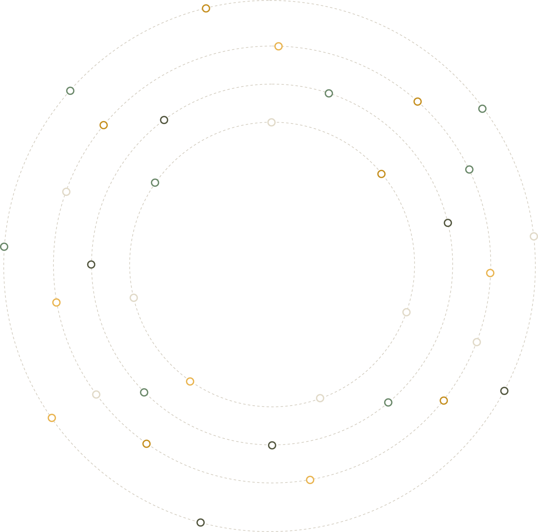
Orbiting Circles
Primary asset. Concentric dashed orbits + node circles in Gold, Sage, Ink, Pale. Used: Hero bg, large-format print, section fills. Always full-bleed or partially cropped — never shrunk to fit a box.
Quarter Circle
Used: Dark section corners. Concentric arc lines in Lime at low opacity. Adds curvature language to otherwise rectangular dark blocks.
Arrow / Node Grid
Used: Intro card background. 768×853px. Grid of dot nodes (open circle) with highlighted nodes in Sage and Lime. Animates on page load via CSS keyframes.
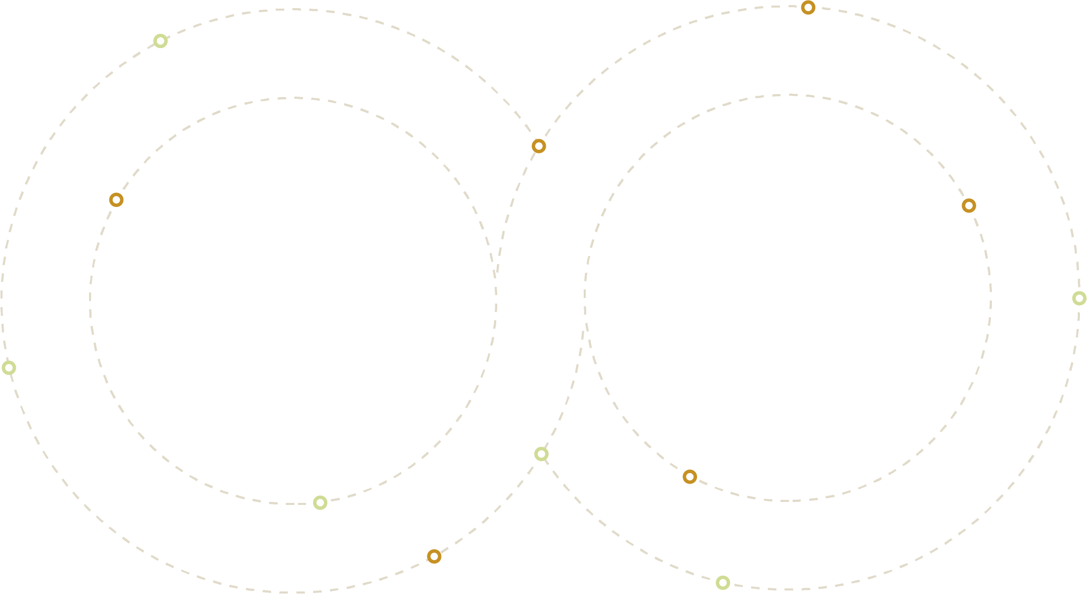
Infinity Loop
Primary asset. Interlocking dashed ellipses with Gold/Lime node markers. Represents the continuous integrated marketing cycle. Always shown complete — never crop. Light bg only.
Dot Texture
Used: Dark section overlays. 14px grid, 2.5px dots in Lime at 20% opacity. Fade-out radial mask at edges. Provides texture without distracting from content.
Nested Ellipses
Used: Challenge section right-side depth element. 851×851px. 3 concentric ellipses, sage fill + stroke. Always positioned right/partially off-screen.
07 — Navigation
Three states: Default (transparent/light bg), Scrolled (blurred glass), Dark (over dark sections). The CTA pill is always Lime — the single consistent anchor across all states.
State 1 — Default (at page top)
State 2 — Scrolled (glass blur)
State 3 — Dark (over dark sections)
Height
114px
Fixed. Scrolled state adds backdrop-filter: blur(12px).
Padding
40px H
Horizontal padding 40–48px. Matches section content edges.
Link style
11px / +0.1em
Uppercase. Opacity 0.6 default, 1.0 active/hover. No underline.
CTA button
Lime pill
Same on all three states. Padding 10px 22px. Font-size 10px.
08 — Dividers & Spacing
An 8px base grid governs all spacing. Section padding is always 80–120px vertical. Dividers are always 2px with no border — height only, borderless. Four divider types cover all contexts.
8px
Gap between tags/chips. Icon internal padding. Micro-spacing within components.
16px
Between form fields. Card internal row gap. Between icon and card title.
24px
Card padding (inner). Button group gap. Between type label and heading.
32px
Card padding (generous). Between heading and descriptor text. Nav item separation.
48px
Between section sub-components. Col gap in 2-col layouts. Footer grid gap.
64px
Between major layout groups within a section. Card-to-grid gap in 3-col services.
80px
Section vertical padding (compact). Top/bottom of mid-density sections.
120px
Hero section padding. Max vertical breathing room. Used at section top on hero/intro.
09 — Voice & Tone
h2o's voice is direct, confident, and human. No fluff, no jargon, no inflated claims. The website copy reflects a brand that knows what it's doing and doesn't need to shout about it.
Principle 01
Fearless & Direct
Lead with the statement, not the caveat. "Marketing, without limits." not "Our approach to comprehensive marketing solutions enables…"
Principle 02
Human, Not Corporate
Write like a person talking to another person. No passive voice. No industry buzzwords unless deliberately subverted (see the toggle component).
Principle 03
Specific Over Vague
"Dozens of different touchpoints" beats "complex buyer journeys". "3.8× average ROAS" beats "excellent return on investment". Specificity builds trust.
Principle 04
Confident Understatement
"That's what makes us different." Not "We are the industry-leading…". The work and the specifics do the selling. The tone stays calm and assured.
Copy — Do / Don't
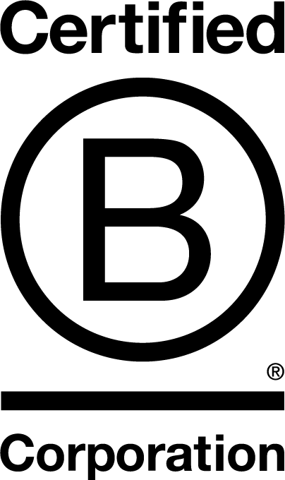
10 — B Corp
h2o creative is a certified B Corporation — a legal designation holding the business accountable to people, planet, and profit equally. The B Corp logo is an official certification mark and must be used exactly as supplied, without modification.
Lockup A — Reversed / White
Use on all dark (#323526) backgrounds. Footer, dark section overlays, dark marketing collateral.
Lockup B — Standard / Black
Use on all light backgrounds. White card surfaces, light footers, printed materials, email signatures.
Minimum Size
50px tall
Minimum display height in digital contexts. Below this the "Certified" and "Corporation" text becomes illegible. Never crop or scale disproportionately.
Clear Space
= width of "B"
Clear space on all sides must equal at least the visual width of the "B" letterform. No other logos, text, or graphics within this exclusion zone.
Usage Rule
2 versions only
White on dark. Black on light. No colour tinting, no sage/lime recolours, no drop shadows applied to the mark itself. The certification mark must remain unmodified.
✓ Do
✗ Don't
In Context
Footer
© 2025 h2o creative
About / Cards
We measure what matters — people, planet, and profit.
Partnership / CTA
B Corp certified — we measure what matters.
11 — Motion
Three motion behaviours drive the h2o website experience: scroll-triggered fade-up reveals, infinite-scroll reel animation, and hover micro-interactions. All transitions use the brand easing curve — never linear.
Hover Lift — Cards & Orbs
transform: translateY(-4px)
transition: 0.25s ease
Cards lift 4px. Orbs lift 6px + scale(1.06). Shadow deepens proportionally. Never bounce or spring on simple hover.
Scroll Reveal — Fade Up
bwFadeUp keyframe
0.6s cubic-bezier(0.16,1,0.3,1)
All .reveal elements fade up 16px on IntersectionObserver. 80ms stagger per element. Threshold: 0.12 (12% visible triggers).
Button Hover — Lime Pill
transform: translateY(-2px)
box-shadow: 0 6px 20px rgba(211,230,148,0.45)
Only buttons lift 2px (half of cards). Lime glow shadow always uses the brand colour at 45% opacity, not black.
Node Pulse — Touchpoints
bwPulse · 2s ease infinite
Used on dot matrix highlight nodes. Lime dots pulse with Lime shadow; Sage with Sage shadow. 0.5s stagger between nodes in sequence.
Input Focus — Gold Ring
box-shadow: 0 0 0 3px rgba(229,172,52,0.18)
transition: 0.2s ease
Gold ring (not Lime) on focus. No border appears. Ring expands from 0 to 3px spread. Click the input above to preview.
Easing & Duration Reference
Micro (hover)
0.2s ease
Buttons, links, icon containers. Fast enough to feel responsive.
Card (hover)
0.25s ease
Service cards, logo pills, all elevated surface hovers.
Scroll reveal
0.6s cubic-bezier(0.16,1,0.3,1)
The brand's "spring" — overshoots slightly then lands. Use for all reveal animations.
Never use
linear or bounce
Linear feels mechanical. Bounce feels playful — neither fits the h2o brand.